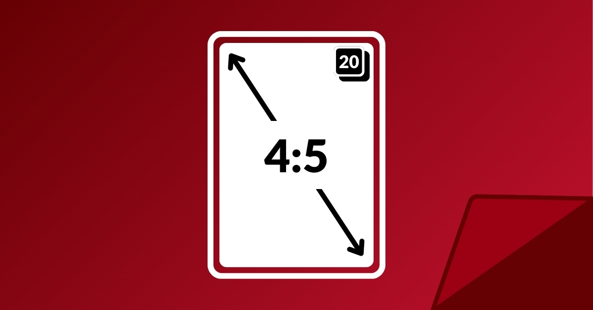
When creating content, it’s best practice to ensure your posts are sized correctly for the social media platform you’re publishing to. Instagram is gradually phasing out its iconic 1:1 grid in favor of a more creator-friendly 4:5 ratio. With the growing popularity of reels and the influx of vertical (non-video) content on the platform, this drastic shift makes sense. Additionally, Instagram expanded the number of photos and graphics in a carousel post from 10 to 20 frames, offering more flexibility in content presentation.
What do these changes mean for those who aren’t content creators? What processes or strategies should your marketing team start implementing? And if you, as an Instagram user, haven’t received the grid update yet, how can you prepare for the full 4:5 integration? We’ll break down everything you need to know to make the most of these updates.
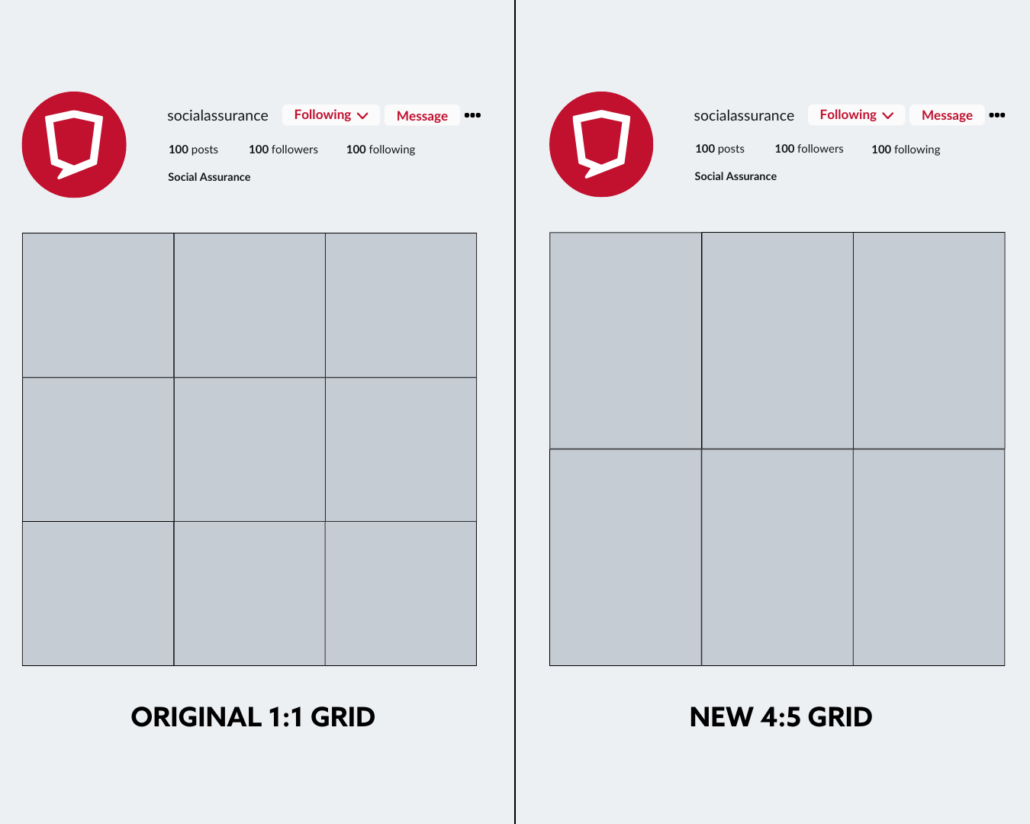
Instagram is shifting from the traditional 1:1 grid (left) to a new 4:5 ratio (right), impacting how your profile feed will display. These mockups show the anticipated visual changes when followers visit your page.
The Impact of 4:5 on Existing Content
When Instagram users visit your financial brand’s profile, they see all your public posts arranged in a grid. For many, maintaining a cohesive grid layout is important. While it might seem trivial, a well-organized grid often sets professionals and amateurs apart.
Those who tailored their content to fit the 1:1 ratio may notice their grid doesn’t look quite as polished with the new 4:5 ratio. Once the update is fully integrated, all posts published prior will be automatically stretched to conform to the new 4:5 sizing. This adjustment can result in awkward cropping of graphics and photos, potentially disrupting the visual harmony of your profile.
A disjointed grid can undermine the trust and professionalism your brand seeks to convey, making it harder to convert profile visitors into leads, account openings, and other key actions. For financial institutions, especially those targeting demographics like Gen Z, ensuring your grid remains visually cohesive is essential for driving engagement.
Maximizing Your Carousel Potential
Some users fall short when it comes to using carousels to their fullest. A carousel is a feature that lets you include multiple photos, videos, and graphics in a single post, allowing your audience to swipe through them. Long before carousels were introduced, users across the platform faced challenges with cramming a lot of information into a single graphic, choosing the best photo from an event, or hoping a video could capture the full story.
Now, with up to 20 frames at your disposal, you can effectively distribute information in an engaging way using a mix of photos, graphics, and videos. For instance, if you’re creating a financial literacy post that covers various terms and definitions, you could use multiple frames to break down the content. We featured an example from FNBO, where they creatively tied personal finance to a fun Harry Potter theme. The post was more engaging because each “financial house” had its own frame. Dedicating 3-4 frames to different categories of terms, using engaging visuals and concise definitions, helps your audience easily absorb and retain the information.
Instagram has also refined its sizing requirements for carousel posts. While individual frames should be designed at a 4:5 ratio (1080 by 1350 pixels), the grid view will display carousels at a 3:4 ratio (1012 by 1350 pixels), making it crucial to keep key elements centered to avoid unintended cropping.
Optimizing Reels & Stories for Instagram
Reels and Stories continue to be a significant part of Instagram’s content ecosystem. Here are some important size ratios to keep in mind when creating these types of content. Reels should be created in a 9:16 format (1080 by 1920 pixels), but also keep in mind, when displayed in the grid, they will appear at a 3:4 ratio (1080 by 1440 pixels). This means only the center portion of your Reel will be visible in your profile, reinforcing the importance of keeping crucial text and footage within that central area.
Similarly, Stories should be designed at a 9:16 ratio (1080 by 1920 pixels), but the safe area for important text and visuals is slightly smaller (1080 by 1610 pixels). Keeping text and key imagery in this space ensures they remain visible without interfering with Instagram’s UI updates.
How to Move Forward
While the carousel update is accessible to all users, the 4:5 grid is slowly making its way across users on the platform. During this interim period, what can you do to make sure your posts look cohesive? What habits should you implement within your team when it comes to creating content?
From volunteer work to sponsorships and fundraisers to financial literacy initiatives, a habit must be built to take a few vertical photos and videos when obtaining content for socials. While it’s great to get content that’s flexible and fits within the criteria for all the platforms community banks, credit unions, and financial brands are on, Instagram is now a special use case. Emphasizing the need for taking both vertical and horizontal on a shot list is crucial, even though with current 1:1 ratios, it’ll be a relief to see any future materials seamlessly change into the 4:5 grid.
The most tedious, but crucial, adjustment will be with graphic design. Designs should be created as a 4:5 ratio while ensuring that all information fits well within the current 1:1 grid until the transition is complete. For carousels, be mindful of the 3:4 crop in the grid view by centering important content. Likewise, for Reels and Stories, keeping key details within the designated safe areas will ensure optimal visibility.
We know keeping up with updates as transformative as the 4:5 grid can be overwhelming and stressful. Adapting your content to fit new formats and features, like expanded carousels, requires careful planning and execution. Fortunately, Social Assurance’s team is here to take the burden off your shoulders.
Our team specializes in creating and managing content that integrates the latest Instagram updates, ensuring your posts are optimized for the 4:5 grid, and fully utilizing the new carousel capabilities. From designing graphics to crafting engaging posts, we’ll handle the details so you don’t have to worry about the complexities of these changes.